I’m in the process of upgrading my first-generation Core Duo Macbook, which is getting a little long-in-the-tooth. So this afternoon I visited Apple.com and I took a little time to review the specs of the newly released models.
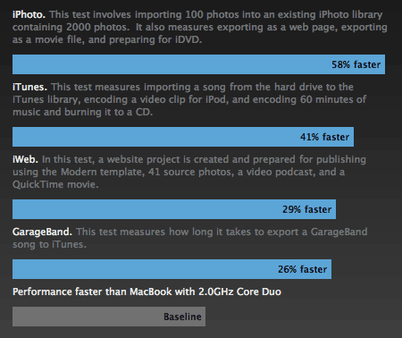
I eventually came across the following bar chart, which is accessible as a pop-up from this page. It compares my current notebook (coincidentally) with the one I intend to purchase.
At first glance, it was obvious that something wasn’t quite right. The percentages listed inside the blue bars don’t even remotely correspond to the visual length of those bars relative to the baseline bar at the bottom. It isn’t even close.
I took a screenshot and did some measuring in Photoshop with the ruler tool. The baseline bar is 216 pixels wide. The bars above it are 357, 362, 382, and 417 pixels wide, respectively. That would yield rounded percentages of 65%, 68%, 77%, and 93%.
I assume the numbers are correct and Apple is just being deceptive to make the performance gains look more impressive. In any case, it’s definitely not cool.
