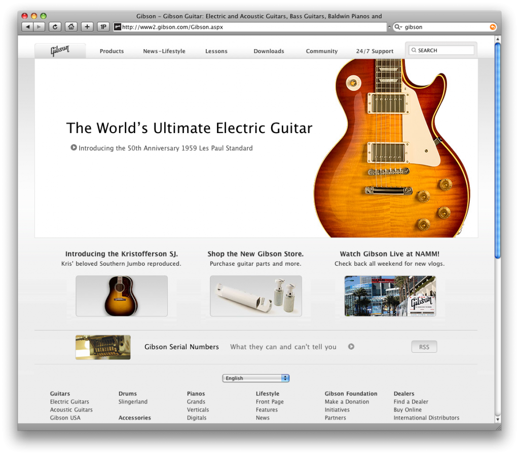
Did Gibson think that nobody would notice when they completely-ripped off Apple for their new website design?
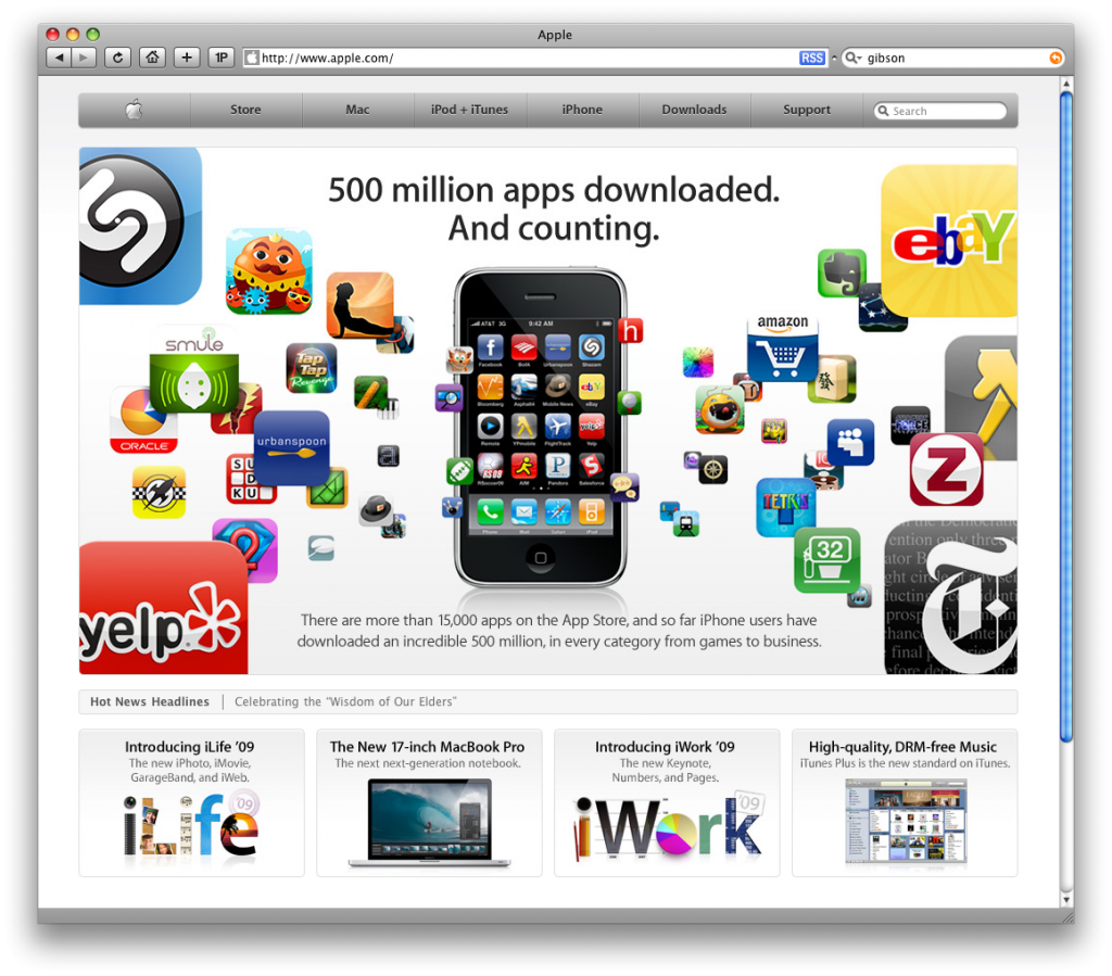
For reference, here is a screencap of Apple’s site:
Which brings me to two points:
- When you have your own iconic brand, you really shouldn’t need to steal so shamelessly.
- It’s 2009, Gibson. Did you really think table-based layout was still a good idea?

